 Mowo
ArcUI Designer
The Mowo Editor window for authoring .ui game screens. Covers the canvas, hierarchy, palette, details, bindings, animations and play-in-designer.
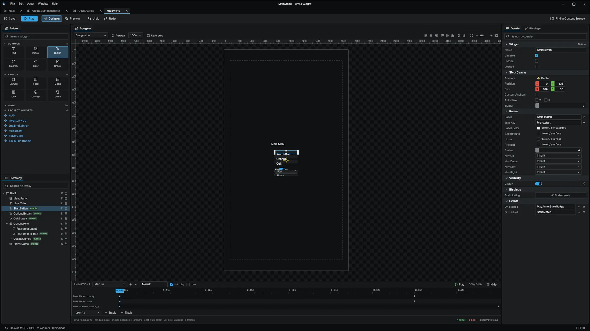
The ArcUI Designer is the Mowo Editor window for .ui assets, the Unreal UMG Designer's counterpart. It shows the live widget tree the runtime factory builds, so what you see on the canvas is what the game draws. This page is a tour of the window and a walkthrough for a first screen.
Layout
| Region | What it holds |
|---|---|
| Toolbar | Save, Undo, Redo, the selection breadcrumb, and the Designer, Play and Preview modes |
| Palette (left, top) | Search, Favourites, Common, Panels, More and Project Widgets |
| Hierarchy (left, bottom) | The widget tree, with visibility and lock toggles per row |
| Canvas (center) | The device frame, the live widget tree and the editing gizmos |
| Animation strip (bottom) | Timelines, tracks and keys |
| Details (right) | Widget, Slot, type properties, Bindings and Events for the selection |
Build your first screen
- Create the asset
In the Content Browser, right-click a folder and choose More > Arc Widget. The editor writes
NewWidget.uiand starts a rename. Double-click the asset to open the designer. - Add widgets
Click a palette row to add it to the selected container, or drag it onto the canvas to drop it inside the deepest container under the cursor. Right-click a palette row to add it to Favourites.
- Place them
Drag to move and use the handles to resize. Moves snap to sibling edges and centers, the parent center, the safe area and an 8-pixel grid. Hold Alt while dragging to turn snapping off.
- Bind data and wire events
In Details, bind a property such as
textto a source, and add anOnentry for events such asclicked. See Bindings. - Check it
Press Play to run bindings and animations on the canvas, switch device frames to test other resolutions, then save.
The palette
The palette opens with a search box and a Favourites section, then three widget sections:
| Section | Widgets |
|---|---|
| Common | Text, Image, Button, Progress Bar, Slider, Check Box |
| Panels | Canvas Panel, Horizontal Box, Vertical Box, Grid Panel, Overlay, Scroll Box |
| More | Video Player, Spinner, Spacer, Uniform Grid, Wrap Panel, List View, Widget Switcher, Toggle Switch, Combo Box, Editable Text, Key Capture, Rich Text, Rich Text Block, Hyperlink, Breadcrumb, Border, Size Box, Scale Box, Retainer Box, Clip Box |
| Project Widgets | Every other .ui in the project, added as a UserWidget node |
More starts closed; a search opens every section, so a match is never hidden.
The asset you are editing is left out of Project Widgets, so a screen cannot embed itself. Favourites last only for the editor session.
The canvas
- Click selects the deepest widget under the cursor. Alt+click or Ctrl+click walks one level up.
- Shift+click toggles a widget in the selection. Dragging on empty space draws a selection band.
- Drag moves the whole selection. The live position and size appear in a badge while you drag.
- Middle or right drag pans; the wheel zooms around the cursor.
Anchors
When the parent is a Canvas Panel, the selection shows UMG's anchor medallion. Drag an arm to move that anchor corner; the widget stays where it is on screen while its anchors change. Click the center of the medallion for the presets. On a stretched axis, each edge gets a handle for its inset.
Device frames
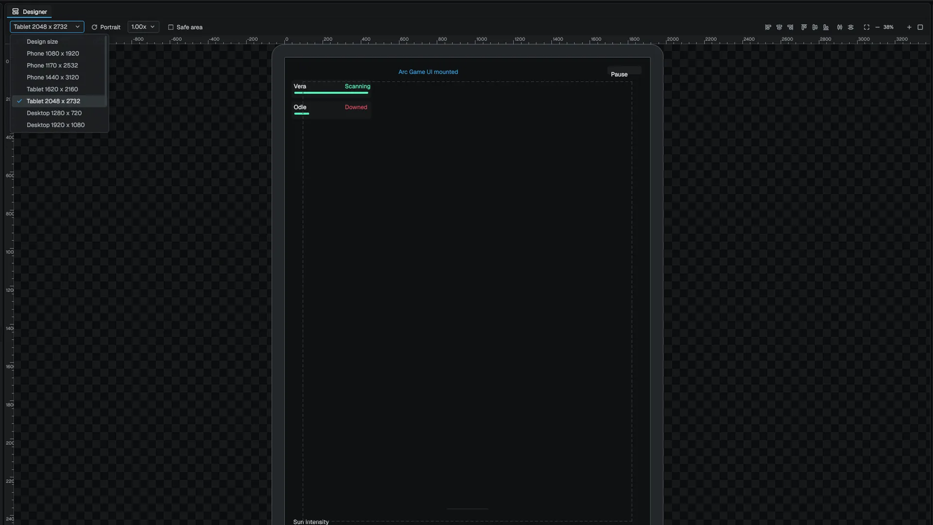
The canvas header has a device dropdown, an orientation toggle and a DPI scale. There are eleven presets:
| Class | Sizes | Safe area |
|---|---|---|
| Design | The asset's own design size | 5% |
| Phone | 1080 × 1920, 1170 × 2532, 1440 × 3120 | 5% |
| Tablet | 1620 × 2160, 2048 × 2732 | 5% |
| Desktop | 1280 × 720, 1920 × 1080, 2560 × 1440, 3840 × 2160 | 5% |
| TV | 1920 × 1080 | 10% |
The DPI scale changes the frame's pixel size without touching the asset's design size, so badly anchored widgets move and you can spot them. None of these choices are saved in the asset.
The hierarchy
One row per node, indented by depth, with a type icon and the node name.
| Control | Behavior |
|---|---|
| Arrow | Collapses or expands the subtree |
| Eye | Hides the node in the designer only (design_hidden) |
| Padlock | Locks the node against picking, moving and nudging (design_locked) |
| Double-click or F2 | Inline rename |
| Drag | Reparents or reorders the whole selection |
| Search | Filters by name and class and keeps each match's parents visible |
Hidden and locked are saved in the asset, but the runtime ignores them. The factory honors them only in designer mode FArcWidgetFactory.
The row context menu has Rename, Duplicate, Copy, Paste, Wrap With, Replace With, Group into Canvas Panel, Select All Children, Expand Subtree, Collapse Subtree and Delete. Wrap With puts a new container around the selection. Replace With changes a node's class and keeps its name, slot, bindings and the children the new class can hold.
Details
Details has sections for the Widget (name, variable flag), its Slot, the type's own properties, Bindings and Events. A search box filters rows across all sections.
- Revert arrow. A property that differs from its default shows an arrow. Clicking it removes the property from the node, so the node goes back to having no opinion.
- Multi-select. With several widgets selected, an edit goes to every selected node whose class has that property. Rows the whole selection does not share are marked.
- Slot. Under a Canvas Panel you get anchors, position, size, far offsets, size-to-content and z-order. Under a box, overlay or grid you get padding, fill weight and horizontal and vertical alignment.
- Colors. Color rows list the theme's tokens first and keep the raw picker one step further in.
The root node's Details include a Visual Script Class picker that writes the screen's visual_script_class, the Visual Scripting controller class.
Bindings and sample values
The bind flyout lists sources in sections: Properties, Visual Script Functions, Recent and Current:
- Properties: reflection paths (
Entity.Component.Property) from the scene. With no scene bound, you type the path by hand. - Visual Script Functions:
visualscript.Class.Functionentries for every pure function of the controller class that takes no parameters and returns a value. - Recent and Current sources.
Each bound source has a sample value you can edit under its chip. The canvas uses it in place of live game data. Sample values are editor state and are never saved.
Play and Preview
| Mode | What runs | Leave with |
|---|---|---|
| Play | Bindings resolve against sample values, auto_play animations start, looping ones loop. Events are reported in a strip at the bottom instead of being dispatched. | Escape or the Stop button |
| Preview | The tree becomes interactive for focus and gamepad checks. Bindings and animations do not run. | Escape or Exit Preview |
Only one mode is on at a time; Designer is the editing mode.
Animations
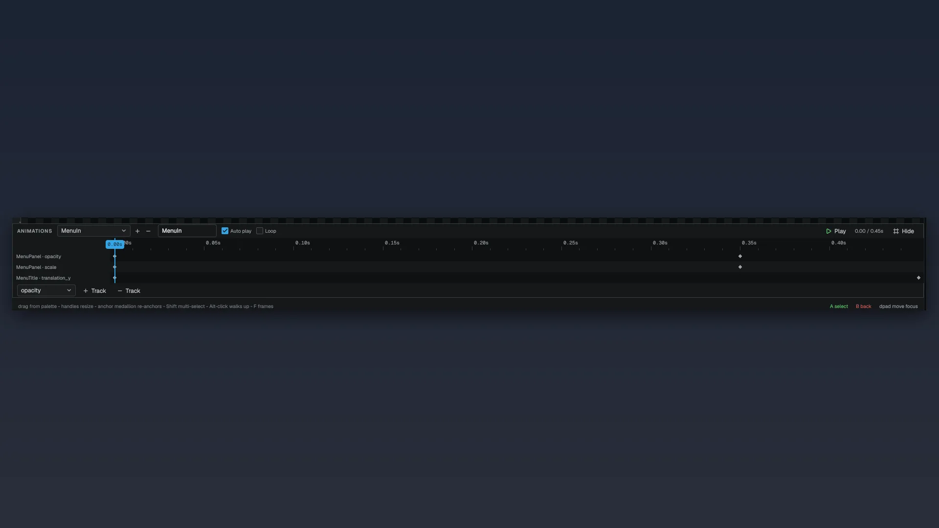
The strip below the canvas edits the asset's timelines: one named animation per entry, one track per widget and property, and diamond keys on a ruler. You can add and remove animations, tracks and keys, set a key's time, value and easing, toggle Auto play and Loop, and scrub by clicking or dragging on the ruler. Space plays or pauses and Delete removes the selected key. The easing list comes from the runtime evaluator, so it only offers curves the game can play.
Keyboard shortcuts
These work while the canvas or hierarchy has focus. They are bound to the designer's editor.arcUiDesigner focus scope, so they do not leak into other panels. See focus scopes.
| Key | Action |
|---|---|
| Arrows / Shift+arrows | Nudge by 1 / 10 design pixels |
| Delete / Backspace | Delete the selection |
| Ctrl+C / Ctrl+V / Ctrl+X | Copy / paste / cut |
| Ctrl+D | Duplicate |
| Ctrl+G | Group the selection into a new Canvas Panel |
| F | Frame the selection |
| F2 | Rename |
| Ctrl+Z / Ctrl+Y | Undo / redo |
| Escape | Close a flyout, clear the selection, or leave Play/Preview |
Undo
Each change is one undo step, and each gesture is one step: a drag records a single Move Widget or Resize Widget entry when you release. Snapshots are the asset's MDF text, so structural edits undo as cleanly as numeric ones.
Known gaps
Favourites do not persist between sessions, and device frames, DPI scale and sample values are editor state that is never saved in the asset.
Related
- ArcUI screens for what each field in the asset does at run time.
- Arc styling for themes and tokens.
- The Visual Scripting editor for writing the controller class.
Engine sources
This page describes behavior implemented in these files of the engine repository, checked against commit 5922e6e5e.
- Engine/Source/Runtime/ArcUI/Public/ArcUI/FArcWidgetFactory.h